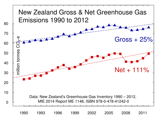
The press release for the co-produced report, promises quite a lot.
Government Statistician Liz MacPherson said the report gives a clear and independent overview, based on the best-quality information available.
Ms MacPherson said the report uses robust data from hundreds of sources, and follows international best practice for environmental reporting. “We would like to improve the data for future reports, and we are working on this,”
"The report is supported by interactive web pages containing trend and regional data. I would encourage people to take a look at the areas they are interested in.”
Wow! Interactive web pages containing trend and regional data! How could I resist the temptation to look for some interactive graphs of greenhouse gas emissions! And to compare their graphs with my graphs.
I browsed on through the 'Atmosphere and Climate' domain to the page for Global greenhouse gas emissions and found only...information on global greenhouse gas emissions. And a factoid that could have culled from any speech by Tim Groser or Nick Smith.
Between 1990 and 2011, New Zealand emitted an average of 0.1 percent of global net GHG emissions.
I tried again at the page Greenhouse gas concentrations. This page reported concentrations of greenhouse gas emissions recorded at Baring Head. Interesting but still no national emissions data.
However, i did find a widget enabling the embedding of a graph the Baring Head atmospheric carbon dioxide data record.
Nowhere from anywhere within the Te Taiao Aotearoa environmental indicator web pages could I find any mention of New Zealand's gross and net greenhouse gas emissions.
I resorted to doing a search of the Statistics website for greenhouse gases. That did turn up a web page showing New Zealand's greenhouse gases. That page clearly reported the trend with a prominent red cross.
Negative change. New Zealand’s net greenhouse gas emissions have increased 42 percent since 1990. New Zealand’s net greenhouse gas emissions increased 42 percent between 1990 and 2013. Total emissions increased 21 percent.
Another widget for embedding. A very plain graph. It uses a different greenhouse gas inventory report published earlier this year from my graphs for 1900 to 2012. The data for 1990 to 2013 uses a different way of calculating the carbon dioxide equivalent values for methane. This increases the year by year values by several million tonnes per year.
Still it just seems so bizarre to have statutory environmental indicators and to not include our national production of greenhouse gases. Especially since Statistics already had the data on it's web page. They need only to have put the link in. Is this cognitive dissonance, self-censorship or climate silence?


